Creating a more impactful brand experience
Glissner uses CleanPhone™ technology to sanitize your phone. Their mission is to make phone sanitation ubiquitous, reduce the need for chemical wipes and prevent the spread of disease.
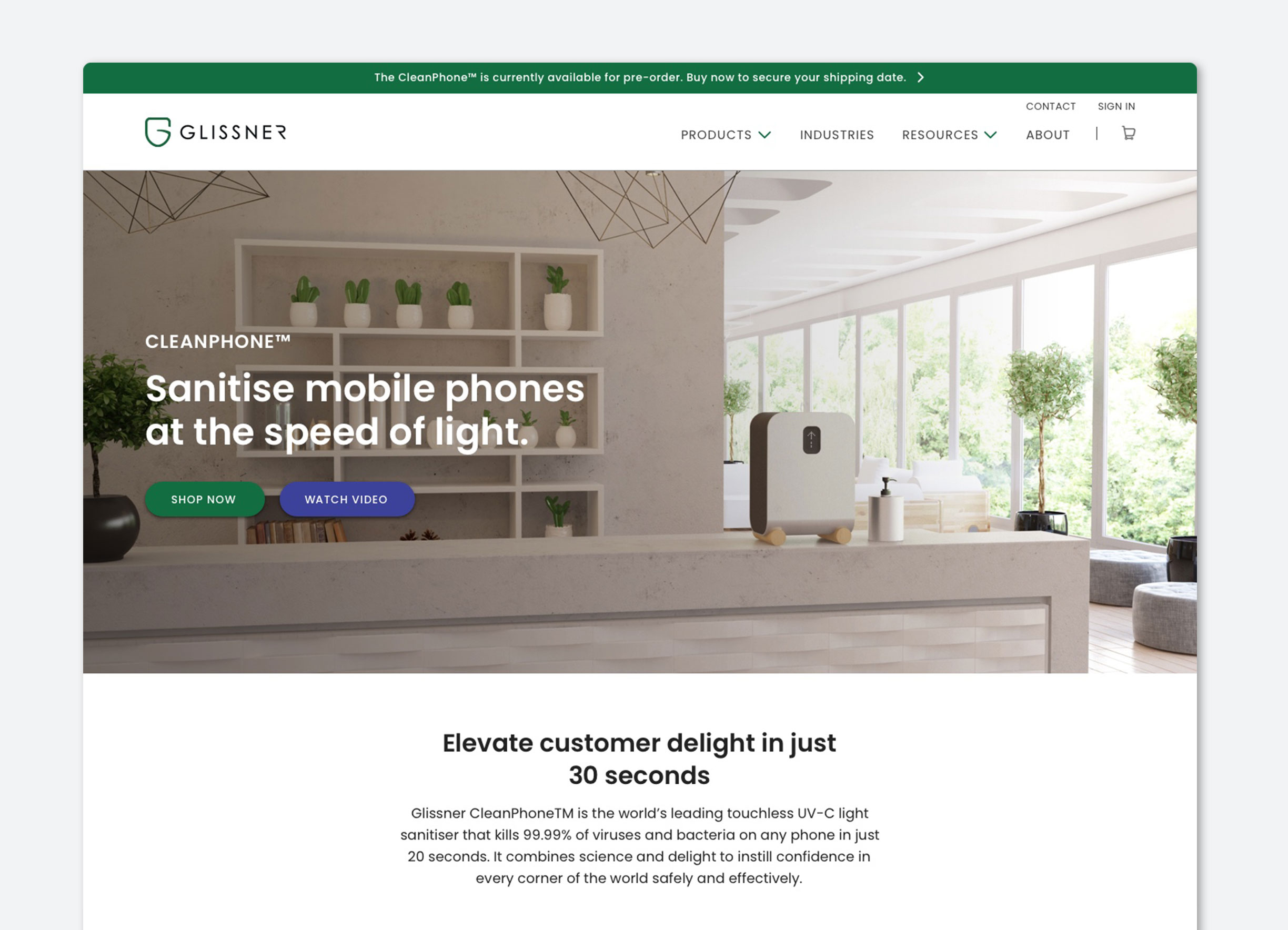
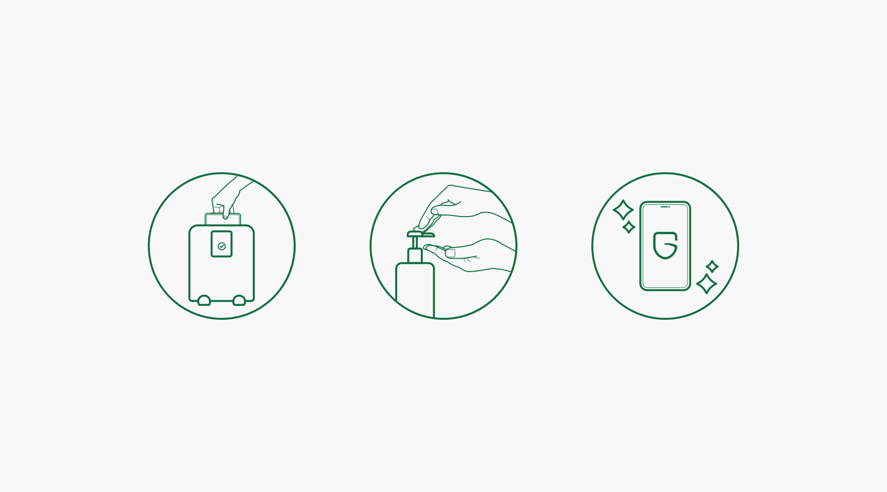
In 2020 Justine was approached by Glissner to create a simple Brand Standards Guide in keeping with their previous corporate identity at the time. Part of this project also involved a website redesign which included content updates to the homepage, product page, industry page and blog. Justine also created 3 custom illustrations to show the simple 2 step process to cleaning your phone.

Problem
The team at Glissner was looking to optimize their website by redesigning certain modules, to create a more digestible and attractive experience. The website overwhelmed visitors with too much copy, it also lacked hierarchy and a clear design system.
Old Website


Solution
In order to create better hierarchy and consistency of information copy was reduced, and more well-defined sections were created. Ultimately, creating an experience that is more concise and has better findability.
Prior to starting work on the website optimization Justine worked on redefining Glissner’s brand guide with additional supporting colours and fonts. Brand colours were used to define product and learn content. After the brand guide was solidified she established a component library/style guide to maintain consistency across different device types.
Certain elements were added to help marry the overall composition. Rounded elements mimic the look and feel of Glissner’s CleanPhone™ device. You can see this in the 3 custom illustrations, image masking and vertical gradient line that leads a user down the page.
Website Redesign – Desktop


Website Redesign – Mobile


Website Redesign – Illustrations

